Checking Warhol 8
In this session we were looking at topical images in newspapers, following a theme. This relates to Warhol's years in advertising. A grounding that must have informed his use of colour and direct communication.
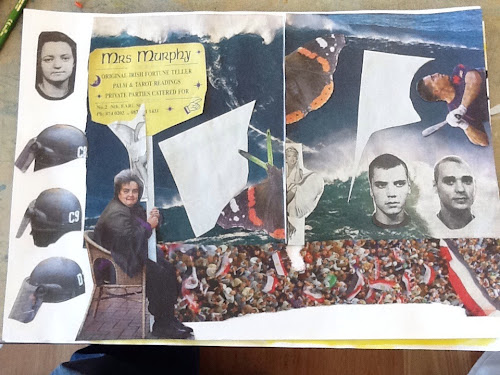
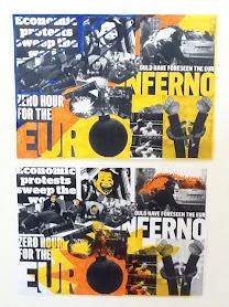
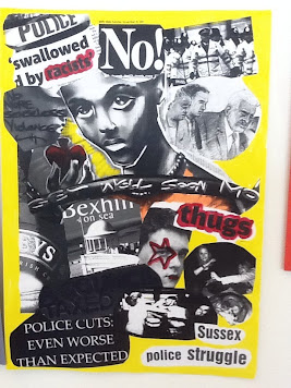
So we cut out a series of images relating to the theme of our choice. Out of these we made a montage about A2 in size, this was then photocopied and we worked into each copy with colour, bearing in mind Warhol's use of colour in the electric chair series in gallery 1 of the De La Warr Pavilion.
I chose threat and death, nice cuddly subjects! Inspired by the 90ft wave that a surfer successfully rode just off Lisbon. I read the article feeling physically sick with fear even though I knew he survived, a powerful story that i didn't manage to do justice to in the language of collage.
So the task was to think of a system for displaying images - ironically I forgot to come up with a system and just collaged them together, but of course I did actually have a system of a kind in my head. I do a lot of collage so am used to playing with images on a surface, balancing shape and form though have to say this was a bit different perhaps due to the time constraints but I think mostly to the fact that I have been used to working with abstract images not messages. Mmm gotta think about this and incorporate it into my work process.
This catches me at an interesting time in my professional development as I had a portfolio review last weekend and it is becoming all too clear that I have a magpies eye for the visual. I am someone who naturally finds it tempting to go in many directions and what will help me now is to choose a focus or more importantly let one emerge from the work that I have already got . To do this though I will have to stop and reevaluate and then test out what paths come to the fore. I think I might have been resisting this because I prefer to remain on the edges (where failure is less likely ) never quite succeeding because I haven't quite committed. So with the Big Flag public art project almost ready for take off I am going to have to do this very thing! coming soon a post about me as a flag pole.....
Communicating with the outside is hard enough but communicating with yourself is the trickiest.
How do I associate colour with the images.
Select one of the images and draw it, I chose one of a massive crowd waving flags. I used black and yellow, thinking about the sense of foreboding a big crowd carries, danger, threat, unstoppable energy etc...
Picasso's guernika is a very powerful political message
Using a limited palate communicates more to the viewer.
More colours confuse the message
A Rolling stones face looks like a pink skull, what does this make you think of?
Images of women being nothing else other than beautiful not reflecting who they are.


No comments:
Post a Comment